Brand-by-brand statistics: Which brands sell the best?
See which brands are driving your revenue, how much capital each brand ties up in inventory, how to select a time period, and how cost of goods sold is factored into the figures.
If you sell products from multiple brands, it’s rarely enough to know your total sales. You need to know which brands are driving sales, which ones are taking up space in inventory without selling, and which ones generate the largest orders. That’s exactly what the Brands page under Statistics shows you.
You’ll find the page in the left-hand menu under “Statistics,” under the “Brands” section. Note that there’s also a menu item called “Brands” under “Products.” That’s where you create and edit the actual brands, while the statistics page only displays figures.
The four key metrics at the top
At the top of the page are four cards that summarize the period you’ve selected:
- Revenue excl. tax (Total brand revenue): all revenue excluding tax for items assigned a brand.
- Number of orders (Paid orders during the period): the number of unique orders containing at least one item from a brand. Each order counts only once, regardless of how many brands it contains.
- Brands with sales (During the selected period): how many different brands have actually sold something.
- Average order value (excl. tax per order): brand revenue divided by the number of orders shown in the table next to it.
One detail is important to understand right away: in the table, orders are counted per brand, but in the total, each order is counted only once. An order containing items from three brands therefore appears in all three rows, but counts as one order in the chart and in the total row. If you add up the rows, you may end up with a higher number than the total, and that’s exactly as it should be. The total only counts orders with at least one item from a specific brand. If you need the store’s total number of orders, check the sales statistics instead.
The table, column by column
The table is sorted by revenue, so the largest brand appears at the top. The page even has a built-in explanation: click on “Column Explanation” below the table to expand the text. The columns are:
- Brand: the brand name. Click on the name to jump directly to the sales report for that specific brand during the same period. If the brand has been deleted, the name is struck through and has no link.
- Orders: the number of paid orders containing products from this brand.
- Products Sold: Total number of units sold from this brand.
- Revenue (excl. tax): revenue excluding tax for the brand’s products.
- Inventory value: the capital the brand currently has tied up in inventory, i.e., inventory multiplied by cost price. This is a snapshot and does not correspond to the selected period.
- Share: The brand’s share of total revenue in the table, expressed as a percentage.
- Average order value: the average revenue (excluding VAT) per order for that brand.
At the bottom is a “Total” row. Here, each order is counted once, just as in the cards at the top, and the “Average order value” in the total row is the brand’s revenue divided by that number. Please note that the total for Inventory Value only includes brands that had sales during the period. If you have a brand in stock that did not sell a single item during the period, its inventory value is not included in that total.
Select the period you want to view
By default, the page displays the current calendar year, i.e., January 1 through December 31 of this year. You can change the period in two ways:
- Using the shortcut buttons: This Month, Last Month, Last 3 Months, Last 12 Months, This Year, Last Year.
- Using the Start Date and End Date fields. Select the dates and click Show Period.
The shortcuts do not correspond to exact calendar months. They count back a certain number of days and then round up to whole months, so the period is usually broader than the name suggests:
- "This Month " runs from the 1st of the month through today, not to the last day of the month.
- "Last Month " is based on the date 30 days ago. If you’re viewing this on the 31st of a month, the button will therefore take you to the month you’re already in.
- "Last 3 months" starts on the 1st of the month that was 90 days ago and ends on the last day of the current month. This typically spans four calendar months.
- "Last 12 months" works the same way with 365 days and typically covers thirteen calendar months.
- "This Year " and "Last Year " are the only ones that are exact, covering January 1 through December 31.
Therefore, always check the Start Date and End Date afterward so you know what the numbers cover. If you need to compare two periods precisely, enter the dates yourself and click “Show Period.” The end date is used exactly as you select it. Only a date that doesn’t exist—such as February 31—is adjusted to the last day of the month. Both dates are included, and the period follows the order date—that is, when the order was placed, not when you shipped it.
Feel free to compare “This Year” with “Last Year” for the same brand. This is the quickest way to see if a brand is on the rise or in decline before you negotiate next year’s contract.
Which orders are included?
The figures are intentionally conservative so they can be used for decision-making:
- Only paid orders are included, and only those with the status New, In Progress, Pending, Ready, Ready for Pickup, Picked Up, or Shipped. Unpaid orders, canceled orders, and orders with the status Credit Memo are excluded.
- Credit memos and return orders are not included, and returned items are not deducted. The figure therefore represents gross sales.
- Revenue excludes sales tax and shipping.
- Only products with a brand assigned are included. If you have items without a brand, they are missing from the total. This is the most common reason why the figure here is lower than your total revenue.
The two graphs
Revenue by Brand
The top graph shows the 10 largest brands in the selected period, measured by revenue excluding VAT. It is only displayed if there is more than one brand with sales.
Inventory value per brand
The second graph is often the one that really opens your eyes. It shows current inventory multiplied by cost for the 10 brands with the highest inventory value, regardless of the period above, and the color of the bar indicates how quickly the inventory is being sold, measured over the past 12 months:
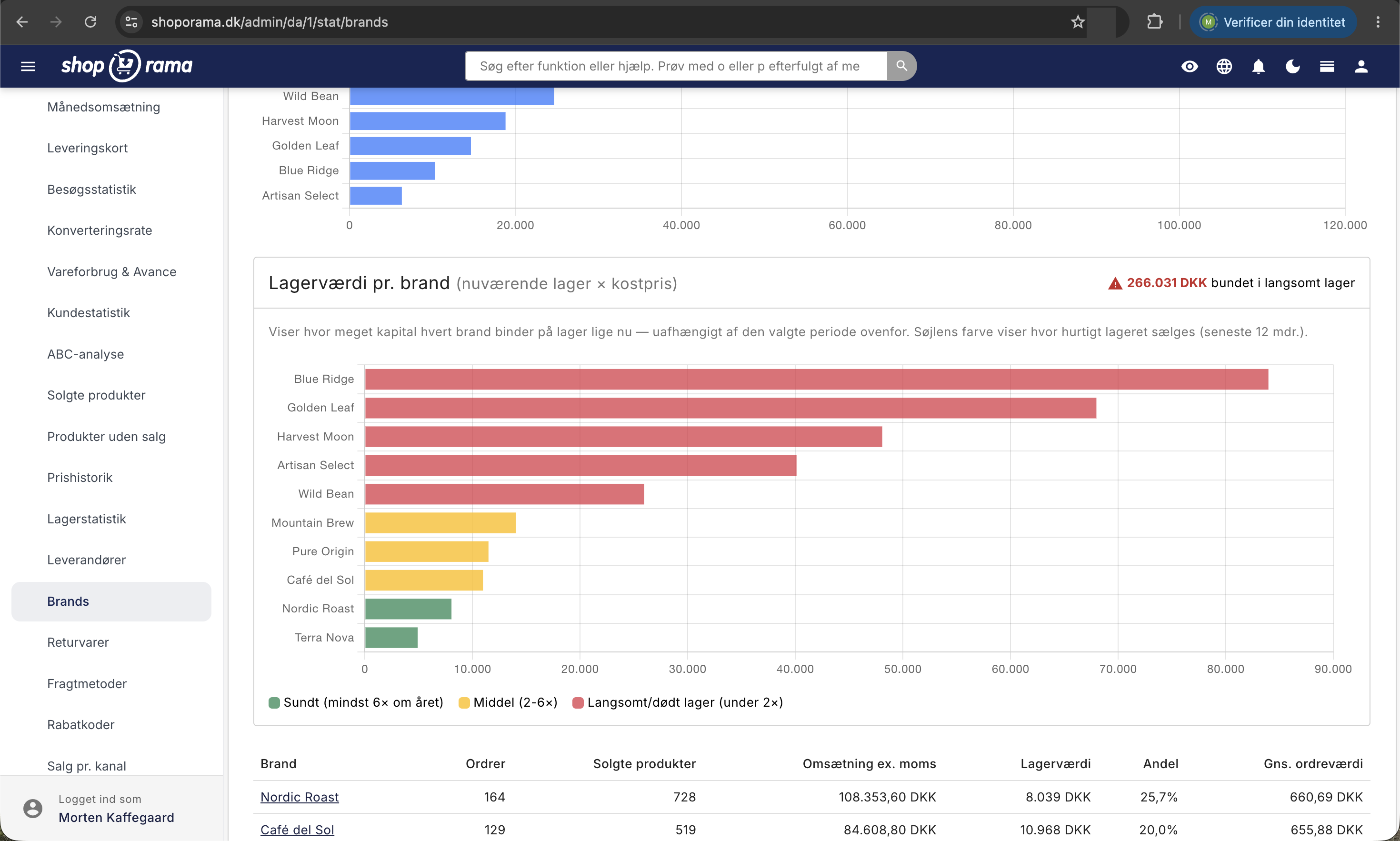
- Green: Healthy, at least 6 times a year.
- Yellow: Average, 2 to 6 times.
- Red: Slow-moving or dead inventory, less than 2 times.
If you hover your mouse over a column, you’ll see four figures: Inventory Value, Sales Volume (12 months), Turnover Rate, and DSI. DSI is the number of days it would take to sell off the inventory at the current rate. A 180-day DSI therefore corresponds to approximately half a year’s worth of goods on the shelf.
In the upper right corner of the card, there is also a red number with the text “Tied up in slow-moving inventory.” This is the sum of the inventory value for all the brands that turn their inventory less than twice a year. It is essentially an estimate of how many kroner are sitting idle on the shelves.
How Cost Prices Are Calculated
Cost prices are the driving force behind the inventory section of the page. Inventory value is calculated based on the price of the item when it was placed in inventory, not on the selling price. The “Goods Consumed” figure in the graph’s tooltip represents the cost of goods sold over the past 12 months, and the inventory turnover rate is simply goods consumed divided by inventory value.
If the cost price is missing, the inventory value will be too low, and the bars will be misleading. In that case, go to Inventory, Cost Prices, where you can enter the missing prices and choose to recalculate the inventory value. Read more in Cost Prices and Inventory Value.
Note that the Brands page does not show contribution margin or profit per brand. If you want to see what a brand is actually earning for you, do one of two things:
- Click on the brand’s name in the table. You’ll be taken to the “Sold Products” report filtered for that specific brand, where each item has columns labeled “DB” (contribution margin excl. tax, i.e., revenue minus cost of goods sold) and “Margin.” If an item’s cost of goods sold is missing, a dash appears.
- View the store’s overall performance month by month in “Inventory Consumption & Profit,” where you’ll find revenue, inventory consumption, profit, and contribution margin.
Brands and manufacturers are two different things
The two menu items under “Products” are often confused, but they serve different purposes:
- Brands are about marketing and sales. A brand has a name, an image, and can be linked to a category or a landing page, so the brand gets its own page in the shop. The brand is also used in filtering and in product feeds. This statistics page is all about brands. See Brands and Labels in Shoporama.
- Manufacturers are a legal requirement. Here, you register the manufacturer’s name, address, email, and website, as well as an EU representative if the manufacturer is located outside the EU. This information is displayed on the product pages because regulations regarding information and labeling for distance selling require it. See Create Manufacturers in Shoporama.
In short: the brand is what the customer buys based on, while the manufacturer is the one the authorities need to be able to find. The same brand can easily be both, but they are listed in two different places, and there are no statistics per manufacturer.
How to Act on the Numbers
- Find the red bars with high inventory value. These are your most costly issues. Run a sale on the brand, move the items to the front page, or simply don’t reorder them.
- Look at the average order value, not just sales. A brand with a high average order value is worth giving better placement because every single shopping cart becomes larger.
- Use “Share” to assess your dependence. If a single brand accounts for more than half of your revenue, you’re vulnerable if the supplier changes its terms.
- Compare two periods before the supplier meeting. Data from your own store is a strong argument when negotiating discounts or marketing subsidies.
- Drill down to the product level. A brand may have strong revenue but poor profitability. You’ll see this first in the Gross Profit and Margin for the brand’s products.
Download the data as a CSV
The CSV button in the top right corner downloads the table as a file, with the dates you’ve selected. The file is named brands.csv, is semicolon-separated, and contains both one row per brand and a grand total row. The total row follows, so “Orders” counts each order once, and “AOV” is calculated based on that number. The column headers are in English: Brand, Orders, Products sold, Revenue ex. VAT, Stock value, Share %, and AOV. The numbers are formatted with a Danish comma, so they can be opened directly in Excel.
Frequently Asked Questions
Why doesn’t the revenue here match my total revenue?
Because the page only counts items that have a brand assigned to them. Additionally, the figure excludes VAT and shipping, and returned items are not deducted. If you have many items without a brand, the difference will be significant. Open the product list, click “Customize View,” and enable the “Brand” column to see which items are missing a brand.
Why do the rows under “Orders” add up to more than the total?
Because an order containing items from multiple brands appears in each brand’s row but counts only once toward the total. An order with items from three brands therefore contributes 1 to each of the three rows and 1 to the total. Both the rows and the total are correct; they simply answer two different questions.
Why doesn’t the “Number of Orders” match the number of orders I’ve received?
The total only counts paid orders with at least one item that has a brand assigned to it. Orders that contain only unbranded items are not included, and the same applies to unpaid and canceled orders. You can find the actual number of orders in the sales statistics.
The number of orders has decreased, and the average order value has increased. What happened?
Previously, the total was calculated as the sum of the rows, so an order with items from three brands was counted three times. Now, each order counts only once in the charts, in the total row, and in the total line of the CSV file. That’s why the “Number of Orders” is lower than before, and the “Average Order Value” is higher, because the same revenue is spread across fewer orders. The figures in the individual rows are unchanged, and your revenue is the same.
A brand has a stock value of 0 DKK, even though the items are on the shelf. What’s wrong?
A cost price is missing from the inventory entries when the items were received. The inventory value is based on the price of the item at the time of receipt, not on the selling price. Go to Inventory, Cost Prices, enter the missing prices, and select to update the inventory value.
Can I view the contribution margin per brand?
Not directly in this table. Click on the brand name to open the “Products Sold” report filtered by brand, which shows the contribution margin and gross margin per item. If you want the store’s total contribution margin month by month, use “Product Consumption & Profit.”
Why is there a brand in the inventory graph that doesn’t appear in the table at all?
The table only shows brands with sales during the selected period, while the inventory chart shows all brands that currently have items in stock. A brand you haven’t sold any items from can therefore still appear as a large red bar. That’s actually the point of the chart.
What exactly do DSI and inventory turnover mean?
Inventory turnover is how many times a year you sell through your inventory of that particular brand. DSI is the same number converted to days—that is, how long it takes to sell through the inventory. Four times a year corresponds to approximately 91 days. A higher turnover rate and lower DSI mean that your money is working faster.
Do returns and credit memos count toward these figures?
No. Credit memos and return orders are completely excluded from the table, and returned goods are not deducted from the brand’s revenue. If you need a net figure for bookkeeping, returns must therefore be offset separately.
Can I share the figures with my accountant or supplier?
Yes. Select the period, click CSV, and send the file. Be sure to mention that the revenue excludes sales tax and shipping, that these are gross sales before returns, and that the inventory value is a snapshot from the day the file was downloaded.
Can Claude retrieve the figures for me?
Yes. If you’ve connected Claude to the store and the Statistics section is set to Read-Only or Read & Edit, you can, for example, type “Which brands sold best last quarter?” Claude uses the same calculation as the website, so here, too, each order counts only once toward the total. Learn more in Statistics and Reports with Claude.
Related articles
See your revenue
Guide to viewing your revenue in Shoporama - both on the front page, via the detailed revenue statistics with graphs, and via order export.
Cost Prices and Inventory Value
Fill in any missing cost prices to get a more accurate inventory value and profit margin. Guide to the Cost Prices page.
Products Sold: Sales Report and Reorder
The "Product Sales" report shows your sales by product for a selected time period, along with current inventory and sales rate, so you can plan...
Cost of Goods Sold & Profitability: Understand your online store's break-even point
Cost of Sales & Profit gives you an overview of your profit margin per month. Learn how to use the numbers to make better decisions on pricing,...
Brands and brands in Shoporama
Guide to brands and brands in Shoporama: create brands, upload logos, link to brand pages, use in filtering, Google Shopping and statistics.
Create manufacturers in Shoporama
Guide to creating manufacturers in Shoporama - a legal requirement for certain products from 2025.
Warehouse statistics - overview of your warehouse
Stock statistics give you a complete overview of your stock situation - from tied up capital in dead stock to products that are running low.