Page designer
Lær hvordan du bruger Sidedesigner i Shoporama til at opbygge sidelayouts med blokke som hero-sektioner, produktlister, bannere og meget mere, helt uden kodning.
With Page Designer, you can build your own page layout by adding, moving, and configuring content blocks. You can create unique layouts for your homepage, category pages, product pages, landing pages, checkout, and many other types of pages—all without any coding.
Where can I find Page Designer?
You’ll find Page Designer under Store » Design » Page Designer in your Shoporama admin panel. Here, you can create new page layouts or edit existing ones.
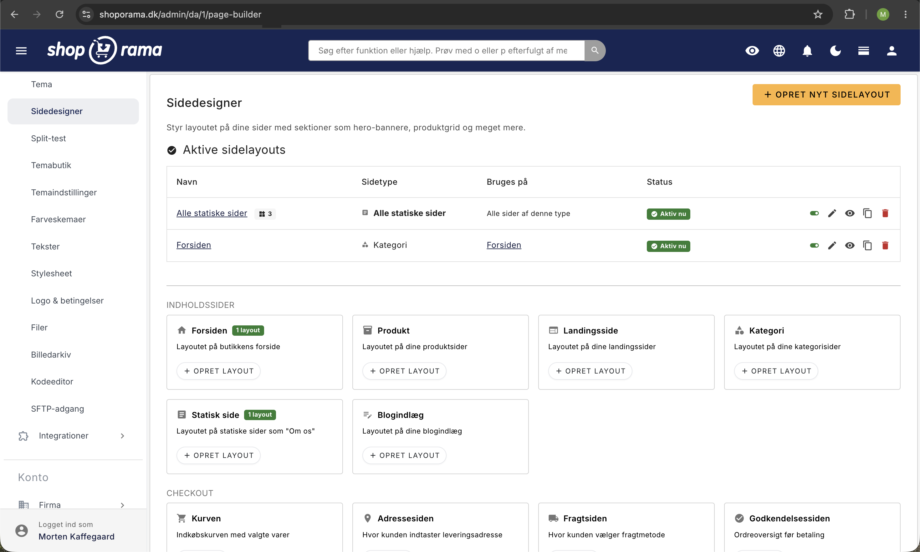
Which page types does Page Designer support?
Page Designer supports two groups of page types. The first group consists of dynamic pages, where you can choose whether the layout should apply to all pages of that type or only to selected pages:
- Category (including the homepage). The layout for all category pages and the homepage. The homepage is the category marked as the homepage category, so if you want a special homepage layout, create a specific category setup that points to that exact category.
- Product. The layout of product pages.
- Landing page. The layout of landing pages.
- Static page. The layout of static pages, such as About Us and Terms and Conditions.
- Blog Post. The layout of blog posts.
The second group consists of static pages, where there can only be one layout per store:
- Search page
- Shopping Cart
- Address page (at checkout)
- Shipping page (during checkout)
- Confirmation page (during checkout)
- Payment page
- Thank-You-for-Your-Order Page
- Add-ons page
- Order page
- Returns Center
- Login Page
- Create Account Page
- User's Orders
- User's Wish List
If your theme defines its own theme tags (reusable content areas), you can also create Page Builder layouts for them. They appear in a separate group when creating layouts.
Important: The homepage is not a separate page type. The front page is managed via the Category type, because in Shoporama, the front page is always a regular category marked as the front page category. There is also no 404 page in Page Designer. The 404 page is managed via your theme and cannot be designed using Page Designer.
How to create a page layout
- Go to Store » Design » Page Designer.
- Click Create New Page Layout.
- Select the page type the layout should apply to.
- If desired, give the layout a name so you can recognize it in the list.
- Click Create. You’ll be taken directly to the section editor, where you can start adding blocks.
- By default, a dynamic layout applies to all pages of that type. If you want to limit it to specific pages, open Settings and add the pages under “Select Specific Pages.” Static pages can only have one layout per store.
Tip: You can create one general layout for, say, all product pages, and then create a specific layout for selected products that should look different. Specific layouts take precedence over general ones.
How to Build the Home Page
The homepage is a regular category that is marked as the homepage category. If you want to give the homepage a special look, do the following:
- Make sure you have a category marked as a homepage category (this is done on the category itself). Read more in Setting Up the Homepage.
- Go to Page Designer. Under the heading " Content Pages," there is a card labeled " Front Page."
- Click Create Layout on that card. Page Designer creates a category layout that is already linked to your front page category.
- Add the blocks that will make up the homepage, such as a hero banner, a product carousel, a USP block, and a blog list.
This specific setup is now applied to the homepage, while your other categories use the general category setup (or the theme’s default).
Available Block Types
The available block types depend on your theme. Here are the most common ones in Delaware, DelawareDK, and Montana:
- Hero. Large hero section with a headline, description, button, and background image.
- Banner. Images in a carousel/slider format.
- Text. Free-form text block with a heading and formatting.
- Text with Image. Two columns with text on one side and an image on the other.
- Two-Column Text. Text divided into two columns.
- Product List. Display products from a category, a landing page, or based on popularity or recency.
- Product slider. Products in a carousel format.
- Category list. Display product categories.
- Category slider. Categories in a carousel format.
- Image Grid in Delaware and DelawareDK, Image Gallery in Montana and MontanaB2B. A grid of images with optional links.
- Address & Map. Display the store’s address with an interactive map. No Google Maps API key required. Learn more.
- Facebook. Follow button for your Facebook page (or embed a feed using your own code).
- Instagram. Display your public Instagram profile with your latest posts, a “Follow” button, or both.
- Blog List. Display the latest blog posts.
- Trustpilot. Widget with Trustpilot reviews. Available in Delaware and DelawareDK, but not in Montana.
- Value Propositions in Delaware, Value Offers in DelawareDK, and Values/USPs in Montana and MontanaB2B. Highlight your USPs, such as free shipping or fast delivery.
- HTML (called “Custom Code” in Montana and MontanaB2B). Plain HTML for full control over the content. The code appears where the block is located on the page.
If you’re using a different theme, the list may look different. Open a setup and click the “Modules” tab on the right-hand side to see which blocks your theme actually supports.
The HTML block cannot place code in the page’s `<head>`. The block inserts your code where it appears in the layout—that is, within the page’s content. If the code needs to be placed in the page’s <head>—such as a verification meta tag from Google Search Console (google-site-verification), Bing Webmaster Tools, Pinterest, or Meta—you must go to Webshop → HTML Fields in the admin panel and set Placement to Insert at the end of <head>. The same applies to Cookiebot, Google Tag Manager, and other scripts that need to load early. Here’s how to use HTML fields.
Newer blocks you may not have noticed
The list of blocks is constantly expanding, and the latest ones have been added in Montana. Here are the blocks that have been added to the classics, and what you can use them for. The names below are the ones you’ll see in Montana. In DelawareDK, they have almost the same names, and in Delaware, they’re listed in English. If a block is only available in certain themes, it’s indicated next to the block.
Also, please note that several of the familiar blocks have been renamed in Montana. “Hero” is now called “Large Banner,” the product slider is called “Product Carousel,” the image grid is called “Image Gallery,” and the HTML block is called “Custom Code.” It’s the same functionality, just with a name that’s easier to understand.
Heading, Text Banner, and Spacing
- Heading. A true H1 heading for the top of the page, with left, center, or right alignment and an optional thin underline. Use it when the page needs a page heading rather than just a text block.
- Text banner. A narrow strip of text with a background color, text color, alignment, and font size. It can be made clickable with a link, and if you check the “Can be closed” box, the message will display a small checkmark. When a visitor closes the banner, it remains closed in their browser. Ideal for “Free shipping on orders over 499 kr.” or a short promotional message. Available in Montana and MontanaB2B.
- Spacing & Separators. Clean spacing between two sections in five sizes, from extra small to extra large, with the option of a horizontal line in the middle. Solves the classic problem of two sections being too close together. Available in Montana and MontanaB2B.
Blocks that highlight products and categories
- Product block. A single product displayed prominently with an image, name, price, and a button to the product page. You choose whether the image is on the left or right, how the two columns are divided (50/50, 60/40, or 40/60), and whether to include the product description.
- Product Feature. A promotional area with a headline, body text, two buttons, and a background image, plus a product carousel next to it. Great for “Brand of the Month” or a new collection.
- Category Feature. Same concept, but for categories. Choose up to three categories, a background image or background color, a light or dark overlay, and the size of the category images.
- Hero video with category or landing page. A large banner with a background video and up to three featured categories or landing pages on top. Available in Delaware and DelawareDK.
Newsletter in the middle of the content
The newsletter block places a sign-up form directly within the page’s content, so you’re not limited to collecting sign-ups in the footer. You can choose from three layouts:
- Simple. A centered form on a colored background.
- Centered with background image. Same layout, but with an image behind it and a light or dark overlay.
- Split with image. Image on one side and form on the other.
In addition, you can set the headline, body text, button text, and a consent text below the form, and you can choose whether to also ask for the first name. Where the sign-ups end up depends on whether you’ve enabled “Use internal newsletter list ” in the newsletter module:
- If this setting is enabled, the sign-up is created as a subscriber in the store’s own newsletter module and added to your default list. If you’ve also enabled “Require confirmation (double opt-in),” the subscriber will automatically receive a confirmation email and won’t become active until they click the link in the email.
- If the setting is turned off, the sign-up is instead forwarded to the external newsletter system you’ve connected, such as Mailchimp, Klaviyo, or Brevo. This means that no subscriber is created in Shoporama’s own newsletter module, and any confirmation email is handled by the external provider.
In both cases, Shoporama stores a consent record with the time, IP address, and browser so you can document the subscription. Read more in the Newsletter Module.
Module Panel: How to Add a Section
You add sections from a panel on the right side of the section editor. If the panel is closed, open it from the Modules tab on the right side of the screen. The panel remembers whether you had it open or closed, so it will be exactly as you left it the next time you open it.
- Search field. Type, for example, “product” or “text,” and the list will be filtered immediately. The search includes both the module’s name and its description.
- Previews. Each module is displayed with a small sketch of its structure, so you can recognize it without having to guess based on the name. The sketches are for reference only and do not show your own design.
- One click. Click on a module, and the section will be added to the page. The new section collapses, the page scrolls down to it, and it flashes briefly so you can see where it landed.
Each section has four buttons in its header: Rename, Expand or Collapse, Copy, and Delete. Copy creates a duplicate right below the original with “(copy)” in the name, which is the fastest way to create two nearly identical banners. At the top of the section list is a button that toggles between “Collapse All” and “Expand All,” so you can get an overview of a long page with a single click.
Some blocks have a “Read more about this block” link at the bottom below the fields. This applies, for example, to “Address & Map” as well as Facebook and Instagram, where you’ll find an article with the full setup instructions.
At the bottom of the page is a fixed bar with Save, Save and Close, and Delete Page Setup. The order of sections is automatically saved when you drag them around, but the content in the fields isn’t saved until you click Save.
Drag and Drop
You can easily change the order of your blocks by dragging them up or down. Grab the block’s header and drag it to the desired position. The order is saved automatically.
You can also collapse blocks to get a better overview if you have many blocks on a page.
Block Configuration
Each block has its own settings, depending on the type. Typical options include:
- Text and headings. Type directly into a text editor.
- Images. Upload images directly from your computer.
- Background video. Upload or select an MP4/WebM video, for example, as the background for a hero banner. The video plays automatically, silently, and in a loop on all devices.
- Product selection. Select specific products, categories, or landing pages.
- Links and buttons. Add URLs and button texts.
- Repeatable elements. In some blocks (e.g., banners), you can add multiple elements within the same block.
You can give each block a custom name to make it easier to keep track of them in the overview.
Product Selector in Delaware/DelawareDK
In Delaware and DelawareDK, several Page Designer sections (Product List, Product Slider, and Product Feature) have a field called Product Selector. This field is used to specify which products should be displayed in the section.
How to Use the Product Selector
- First, select a Product Type from the dropdown menu, such as “By Category Tag,” “By Landing Page Tag,” or “By Product IDs.”
- Then fill in the Product Selector field with the appropriate value (see below).
If you select “Newest Products,” “Popular Products,” or “Most Sold Products” as the Product Type, you do not need to fill in the Product Selector field. The products are retrieved automatically.
What should I enter in the field?
It depends on the selected Product Type:
- By Category Tag. Enter the category’s tag. You can find the tag by editing the category in the admin panel under the “Tag” field. Example: summer-sale
- By Landing Page Tag. Enter the landing page’s tag. You can find the tag by editing the landing page in the admin panel. Example: news
- By Product IDs (found in the Product Slider). Enter the product IDs separated by commas. You can find a product’s ID in the product list or in the URL when you edit the product. Example: 123,456,789
Tip: “Product Selector” is a term used only in Delaware and DelawareDK. Other themes may have similar functionality but with different field names.
General vs. Specific Setups
For dynamic page types, there are two ways to use the Page Designer:
- General setup. Applies to all pages of a given type. For example, one setup for all category pages.
- Specific setup. Applies only to selected pages. For example, a special setup for one specific landing page or for the homepage category.
Specific setups take precedence. If a product has its own setup, that setup is used instead of the general product page setup.
Smarter fields in the Montana theme
The Montana theme uses the latest Page Builder field types, which make it easier to select content:
- Product search. Search for and select multiple products at once. They appear as tags that you can easily add and remove.
- Category search. Select categories and automatically display products from them.
- Landing Page Search. Select landing pages and retrieve their products.
- Smart Link Field. Search across products, categories, landing pages, static pages, and blog posts. Each result is color-coded to indicate its type.
- Video field. Upload or select a background video directly in the section, e.g., for the hero banner. Supports MP4 and WebM, and uses an image in the same section as the post.
In Montana’s Product List and Product Carousel, you can combine products from multiple sources (handpicked products, categories, and landing pages). The system automatically removes duplicates.
Read more in our blog post: Smarter Field Types in Page Designer.
How Your Theme Determines What Page Builder Can Do
Page Builder is the framework. The blocks themselves come from your theme. This is why two stores can have vastly different options within the same Page Builder, and it explains most “why don’t I have that block?” questions. Specifically, it’s the theme that determines:
- Which blocks are available. The Modules panel shows exactly the blocks your theme provides—no more, no less.
- Which fields each block has. Two themes can both have a Product List, but with completely different settings. In Delaware, you fill in a Product Selector field with a category tag, while in Montana, you search for categories and click to select them.
- What the fields are called. Delaware is an English theme, so its field names are in English. DelawareDK and Montana are Danish and display Danish field names. These are the theme’s own texts, not your language selection in the admin panel.
- How the block looks. Design, colors, spacing, and responsive behavior are defined by the theme. Therefore, the same Product List won’t look the same in two different themes.
- Which page types can be designed. A theme does not have to support all page types.
- Whether split blocks are enabled. The ability to place sections both above and below the page’s main content is a setting within the theme.
- Whether theme tags are available. The additional content areas you can design beyond the standard pages are defined by the theme. For example, Alaska2 has space for four footer columns and a bottom row.
That’s why the module panel might be empty
When you create a new layout, Page Designer always displays all fixed page types in the dropdown menu, regardless of which theme you’re using. However, the blocks only appear if the theme also supports that specific page type. For example, if you select the Address page in a theme that doesn’t have blocks for the checkout steps, you’ll get an empty page layout with no modules to choose from.
- Montana and MontanaB2B support all page types, including all steps in the checkout process, the order page, the returns center, and the wish list.
- Delaware and DelawareDK support categories (and thus the homepage), products, landing pages, static pages, blog posts, the search page, the cart, the order confirmation page, login, create account, and the User’s Orders page. However, they do not support the address page, shipping page, authorization page, payment page, add-on page, order page, returns center, or wish list.
- Older and simpler themes may be limited to just a few page types. For example, California only has blocks for static pages, categories, and landing pages.
If the panel is empty, it is not an error in Page Designer. It means the theme does not have blocks for that type of page.
What happens when you switch themes?
Your sections and their content are part of the page layout, not the theme, so they don’t disappear when you switch themes. However, the new theme must recognize the block in order to display it:
- If the block isn’t available in the new theme, the section’s content won’t be displayed. In Montana, a clear message appears on the page instead, indicating that the section is missing. The message is also visible to your customers, so it must be corrected immediately.
- If the block exists but with different fields, the content is preserved. The fields that the new theme doesn’t recognize simply won’t be used. For example, if you switch from Delaware to Montana, you’ll need to reconfigure the product selection in a Product List because Delaware stores a tag, while Montana stores specific products, categories, or landing pages.
- If you switch back to the old theme, everything will be as it was before.
Therefore, review your page setups and check them in the preview immediately after changing themes.
Custom Themes and Themes from the Theme Store
If you have your own theme installed on your store, the blocks are loaded from there. The same applies to a theme from the Theme Store. The order is: your own theme first, then a theme from the Theme Store, and finally one of Shoporama’s standard themes. If you want a new block in your own theme, that’s a task for your theme developer. See also: What themes are available on Shoporama?
Tip: If you’re evaluating a new theme, check its blocks before switching. It’s the blocks—not the colors—that determine how far you can go on your own without a developer.
Split Blocks: Blocks Above and Below the Content
If your theme supports split blocks, you can place blocks in two zones: above and below the page’s main content. This provides more flexibility in the layout. For example, you can have a hero banner above the product list and recommendations below.
When split blocks are enabled, Page Designer displays two separate lists with a visual marker for “Main Page Content” in between. You can freely drag blocks between the two zones.
Tip: Split Blocks is available in the Montana theme and can be enabled by your developer in other themes. Read more in our blog post: Split Blocks: Place Blocks Above and Below the Content.
Preview link: Share drafts with colleagues and clients
When you’re working on a new version of a page layout, you may need to show the result to a colleague or client before going live. You can do this with a preview link: a shareable link that displays your layout on the store, even if it’s offline.
Here’s how it works:
- Find the layout in the Page Designer overview, or open it for editing.
- Click the eye icon in the list, or click the Preview button at the top of the edit view. The link opens the store in a new tab with your layout enabled.
- To share the link with a colleague or customer, copy it from the address bar in the new tab. You can also right-click the eye icon in the overview and copy the link address.
Tip: When someone opens the preview link, they can click around the store and still see the setup because the link is stored in a cookie. A clear banner appears at the top of the page indicating that this is a preview mode that regular customers cannot see. To close the preview, click “Close Preview” in the banner.
Preview links are not indexed by Google or other search engines, so you can safely share them without them appearing in search results.
The link works until the page setup is deleted. If you need to revoke a shared link—for example, because it was sent to someone who no longer needs access—please email support@shoporama.dk, and we’ll reset it for you.
Mobile and desktop: how your sections behave
You build a single layout, and that same layout appears on all screens. There isn’t a separate mobile version that you edit on its own. Instead, the blocks are responsive: they automatically adjust the number of columns and stack content vertically as the screen gets narrower. Here’s what actually happens in Montana, so you know what to expect when you’re building your site.
The number of columns changes with the screen width
Most grid blocks work with three stages: phone, tablet (starting at approximately 768 pixels), and computer (starting at approximately 1024 pixels).
- Product list: 2 products per row on mobile, 3 on tablet, and 4 on desktop.
- Product carousel and Category carousel. 2 visible items on mobile, 3 starting at approximately 640 pixels, and 4 to 6 on large screens. On mobile, you swipe through them with your finger.
- Category list. Depends on the view: Large images show 1 per row on mobile, medium images show 2, small images show 3, and thumbnails show as many as 5.
- Image Gallery. The “Columns” field only applies to tablets and larger devices. On mobile, 2 columns are displayed regardless of your selection, unless you choose a single full-width column.
- Values/USPs. One per row on a phone, two starting at approximately 640 pixels, and your selected number per row starting at approximately 1024 pixels.
- Blog List. 1 per row on mobile, 2 on tablet, and your selected number of columns on desktop.
Two-column blocks stack, and the order matters
- Text and image. On a phone, the two columns stack. If you select Image placement: Left, the image appears at the top and the text below it. If you select Right, the text appears first and the image below it. If you have an important point that should be read first on a mobile device, select Right.
- Product block. Here, the product image always appears at the top on a phone, regardless of whether you’ve selected left or right image placement. This setting applies only to tablets and larger devices.
- Two-Column Text, Category Feature, Product Feature, and Newsletter with Split Image. All of these stack into a single column on small screens. The feature blocks and the newsletter switch to a two-column layout starting at approximately 1024 pixels—that is, on computers.
- Layouts such as 60/40 or 33/66 apply only on tablets and larger devices. On phones, both sections occupy the full width.
Blocks where you need to consider mobile layout yourself
- Large banner. You can choose the height as Small (40% of the screen height), Medium (60%), or Large (the entire screen height). If you choose Large, the banner fills the entire phone screen, and everything else appears below the fold. This might be exactly what you want, but be aware of it.
- The headline size option in the large banner exists precisely because long headlines wrap awkwardly on narrow screens. Set it to Small if your headline takes up a lot of space.
- Category feature. The number of category images next to the text is the same on all screens. If you select Thumbnails, you’ll get 5 small images across the width, even on a phone. Select Large images if mobile users are your primary audience.
- Text Banner. The “Extra Large” and “Giant” font sizes take up a lot of space on a phone. Keep your campaign text brief.
- Images. The theme automatically delivers images in WebP and in multiple sizes, so a phone downloads a smaller file than a computer. You still need to upload a sharp, high-resolution image. Read more in Optimizing Images for Mobile.
How to check the result
- Open the preview link on your own phone. This is the most realistic test, and you can click around the store while the preview is active.
- Alternatively, you can resize the browser window on your computer to make it narrower and watch the sections change as you go.
- If you’re running a split test on the page layout, you can filter the statistics by Mobile, Tablet, or Computer to see if one variant performs better on one screen type and worse on another. Read more in “How to Create and Run a Split Test.”
Important: You cannot display one page layout on mobile and another on desktop. A page layout applies to all devices. If a single section is meant to be displayed only on large screens, that’s a CSS task for your developer.
For Developers
In Montana, each section is wrapped in a `section` element with the `data-section` attribute, where the value is the block’s ID, e.g., `data-section="hero"`. This provides a reliable way to hide or adjust a specific section type at given screen widths using the store’s own stylesheet, without modifying the theme itself. Read more in Custom Stylesheet (Custom CSS).
Frequently Asked Questions
Can I create a separate layout for the homepage?
Yes. The homepage is the category marked as the homepage category. The quickest way is via the Homepage card on the Page Designer overview: click Create Layout, and a category setup tied to your homepage category will be created. That setup is used only on the front page, while your general category setup is used on all other category pages.
Is there a 404 page in Page Designer?
No. The 404 page is not a supported page type in Page Designer. It is controlled by your theme. If you want to change the appearance of the 404 page, you’ll need to adjust your theme’s templates or contact your theme developer.
Which blocks can I choose from?
It depends on your theme, and the blocks aren’t named the same in all themes. Delaware, DelawareDK, and Montana include, among others, Hero ( called “Large Banner” in Montana), Banner, Text, Text with Image, Product List, Product Slider (called “Product Carousel” in Montana), Category List, an image grid block (Image Grid in Delaware and DelawareDK, Image Gallery in Montana), Blog List, a USP block (Value Propositions in Delaware, Value Offers in DelawareDK, and Values/USPs in Montana), Newsletter, and a block for custom HTML code. Trustpilot is available in Delaware and DelawareDK, while Text Banner and Spacing & Separators are available in Montana and MontanaB2B. Open a setup and click the Modules tab on the right-hand side to see the full list applicable to your theme.
Do my Page Designer pages also look good on mobile?
Yes. The default blocks in Delaware, DelawareDK, and Montana are fully responsive and automatically adapt to mobile screens. Hero images are scaled down, columns are stacked one below the other, and product sliders become swipeable carousels. Use compressed images so the page loads quickly even on mobile data.
How many specific setups can I have?
There is no upper limit. You can create as many specific layouts as you want. Each layout can be linked to one or more specific products, categories, landing pages, static pages, or blog posts.
Do many Page Designer blocks affect page speed?
Page Designer output is cached, so the display itself is fast. What typically affects speed is the number of images and videos on the page. Use compressed images and lazy loading whenever possible.
Can I move a block between two layouts?
No, blocks are tied to the layout in which they were created. However, you can duplicate a block within the same layout and manually copy the content to another layout.
Can I see what the page looks like while I’m editing?
Yes. You can click the Preview button at the top of the edit view, which will open a preview link to the store in a new tab. The order of sections is saved automatically when you drag them around, but text, images, and other fields are not saved until you click Save. Then refresh the preview tab to see the result. Even though the setup is offline, you can view it via the preview link, and you can share the link with colleagues or customers.
Can I design the checkout with Page Builder?
Yes, if your theme supports it. Each step in the checkout process (the Address page, Shipping page, Authorization page, Payment Page, and Thank You for Your Order Page) is a fixed page type where you can add, for example, a USP block, a text block, or a custom code block with additional security signals. Montana and MontanaB2B support all checkout steps, while Delaware and DelawareDK only support the Thank You for Your Order page. Alaska2 supports the Address page, Shipping page, and Payment page, but not the Authorization page or the Thank You for Your Order page. The checkout fields themselves are controlled by the theme, not by the blocks.
What is the difference between a “dynamic” and a “static” page type?
There are many dynamic page types (Category, Product, Landing Page, Static Page, Blog Post), so you can have both a general setup and several specific ones. Fixed pages (cart, checkout steps, order page, login, etc.) exist as a single instance per store, so they can only have one layout.
I can’t find the block my colleague has in their store. Why?
Because the blocks come from the theme and not from Page Designer. You’re probably using two different themes. Open a page setup and click the Modules tab on the right-hand side to see exactly which blocks your shop has. If you’re missing a specific block, your options are either to switch themes or to have a developer build the block into your own theme.
Can I create one layout for mobile and another for desktop?
No. A page layout applies to all devices, and the blocks automatically adapt to the screen width. If you want to optimize for mobile, adjust the order of sections, the height of the large banner, the headline size, and how much content appears before the most important content. If you run an A/B test, you can check the statistics afterward to see if a particular variant performs better on mobile than on desktop.
What happens to my sections if I switch themes?
They’ll stay the same. Sections and content are stored in the page layout, not in the theme. However, the new theme will only display the blocks it recognizes, and fields it doesn’t recognize won’t be used. So go through your page layouts and check them in the preview right after changing themes. If something looks wrong, you can switch back, and everything will be as it was before.
The Modules panel is empty on the page I just created. Is something wrong?
No. It means your theme doesn’t have blocks for that specific page type. The Page Builder always shows all standard page types when you create a layout, but it’s the theme that determines whether there’s anything to add. This is most common with checkout steps, which not all themes support. Delete the layout again, or choose a page type that your theme supports.
Can I insert a verification meta tag from Google Search Console using the HTML block?
No. The HTML block (in Montana Custom Code) only inserts code where the block is located in the layout—that is, within the page’s content. A meta tag only works within the page’s `<head>`, so Google won’t find it. Instead, go to Webshop → HTML Fields in the admin panel, insert the tag into a field, and set the Placement to “Insert at the end of <head>.” This also applies to Bing Webmaster Tools, Pinterest, Meta, Cookiebot, and Google Tag Manager. Here’s how to use HTML fields.
If you have any questions about Page Designer, feel free to contact us at support@shoporama.dk.
Related articles
Setting up the front page
Lær hvordan du sætter forsiden op i din Shoporama-webshop. Forsiden er en kategori, som du kan tilpasse med Sidedesigner i understøttede temaer.
Delaware-themed configuration and customization
Complete guide to setting up the Delaware theme on your Shoporama online store. Footer, mega menu, colors, payment icons, Trustpilot, Instagram...
Categories in your webshop
Learn how to create and manage categories in your Shoporama online store. Guide to hierarchical structure, SEO settings, importing via CSV, sorting...
Images on landing pages
How to upload images to a Shoporama landing page and display them correctly in your theme with getImages() and getSrc().
Implement Theme Builder in your theme
Guide to implementing Shoporama's Theme Builder in your theme so the merchant can build pages visually.
HTML fields: Insert Cookiebot, GTM and other scripts in your online store
How to use Shoporama HTML fields to insert Cookiebot, Google Tag Manager, Facebook Pixel, chat widgets and other custom HTML/JavaScript on your...
Related features
Build Your Own Online Store
Build your own online store with Danish themes, a page builder, and an AI assistant. Everything is included, and you own the result. Try it free...
Delaware and DelawareDK: All modules in the page designer
A guide to all 24 modules in the page builder for Delaware and DelawareDK: hero, products, categories, text, and newsletter—field by field,...
Create your own online store—without a developer and without coding
Create your own online store without a developer. Choose a Danish theme, build your pages with drag-and-drop, and get help from AI. Try it free for...
Montana and MontanaB2B: All Modules in the Page Designer
A guide to all 24 modules in the page designer in Montana and MontanaB2B: banners, products, categories, text, and newsletters—field by field.
Page Builder - build professional pages without coding
Build professional pages with Shoporama's visual Page Builder. Drag and drop modules, live preview and responsive design. Included at no extra charge.
Smarter field types in Page Builder
Page Builder has new field types: search and select multiple products, categories and landing pages, plus a smart link field that searches across...
Split Blocks - Place Page Builder blocks above and below page content
Learn how to use `split_blocks` in `theme_settings.json` to split Page Builder blocks into two zones: above and below the page's main content. A...
Above the fold
Above the fold is the content the user sees without scrolling. Learn why it's crucial for conversion and what should appear at the top of your pages.
Build your homepage in the page builder
The Shoporama homepage is a category. Build it using sections in the page designer, display the right products, and make sure the layout doesn't...
CTA - Call to Action
A CTA is a call-to-action like a buy button or sign-up form. Learn what a good CTA contains and how to optimize them for better conversion.
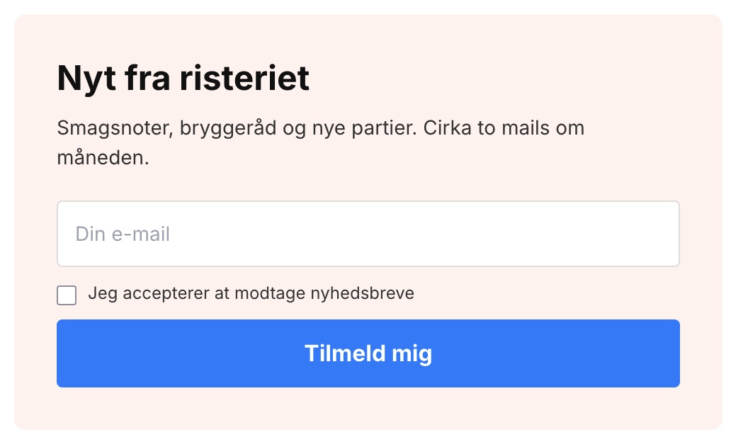
The newsletter sign-up form shouldn't always pop up
Your newsletter form doesn't have to be a pop-up. Now you can copy it onto a page, in the Page Builder, or in your theme, and have multiple...
Webshop design inspiration
Explore Shoporama themes and page designs. Learn the design principles that convert visitors into customers. Try for free for 30 days.
Theme Settings in Montana: An Explanation of All Fields
All groups and fields in Montana's theme settings explained with screenshots: colors, top bar, USPs, product page, checkout, and integrations.
Choose a theme and understand theme settings and the page builder
Select and change themes in Shoporama, and learn the difference between Webstore settings, theme settings, text, and the page designer before you...
Theme Settings in MontanaB2B: Fields and B2B Features
An explanation of all fields in MontanaB2B's theme settings, plus the login screen, prices excluding VAT, customer groups, company accounts, and...