Timing analysis - find your busiest sales periods
Find out when your customers shop with Shoporama's time of day analysis. View heatmaps of days of the week and times and use the insights to time campaigns and newsletters.
What does the time analysis show?
Under Statistics → Time Analysis, you can see exactly when your customers make purchases. The page breaks down your orders by day of the week and time of day, so you can identify patterns in your customers’ purchasing behavior. This is valuable information that you can use to time newsletters, promotions, and customer service.
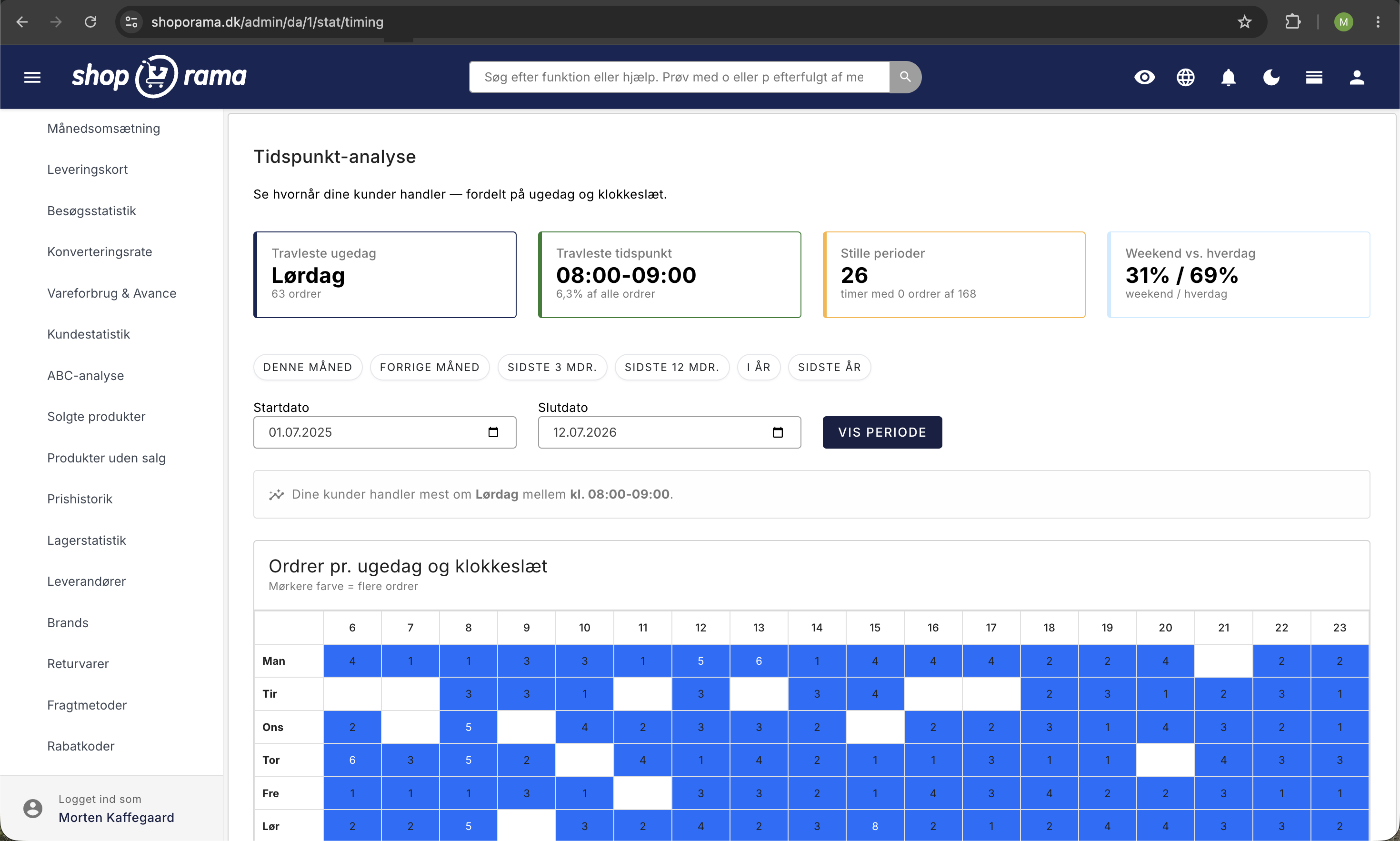
The four key metrics at the top
At the top, you’ll see four charts with the most important insights:
- Busiest day of the week — the day of the week with the most orders. Many Danish online stores, for example, experience high activity on Mondays and Tuesdays, but your pattern may be different.
- Busiest time — the hour of the day when the most orders are placed. Typically, this is in the evening, but it varies from industry to industry.
- Quiet periods — the times when there’s the least shopping activity. This can help you plan maintenance or updates.
- Weekend vs. weekday —a comparison of order activity on weekends versus weekdays.
Heatmap: Day of the Week × Time of Day
The most central element on the page is the heatmap—a grid with days of the week in the rows and times of day in the columns. Each cell shows the number of orders during that hour on that day of the week. The colors range from light (few orders) to dark (many orders), so you can see the “hot” times at a glance.
Hover your mouse over a cell to see the exact number of orders for that time.
Bar Charts
Below the heat map, you’ll find two bar charts:
- Orders per day of the week — shows the distribution of orders across the seven days of the week
- Orders per hour — shows the distribution of orders across the 24 hours of the day
The graphs make it easy to see the overall patterns, while the heatmap gives you the detailed picture.
Tips for using the time analysis
- Time your newsletters — send newsletters during the hours when your customers are most active. If your customers typically shop between 8:00 p.m. and 9:00 p.m., that’s a good time to send a campaign.
- Plan campaigns strategically —launch offers and campaigns on the days of the week that historically see the most traffic. Avoid launching important campaigns during your slow periods.
- Adjust customer service — make sure your customer service is available during peak shopping hours. If your chat or phone lines are closed when customers are most active, you risk losing sales.
- Compare periods — switch between months and seasons to see if the patterns change. For example, holiday shopping may follow a completely different pattern than the summer season.
- Combine with other data — use these insights alongside your conversion rate statistics and overall statistics overview to understand when you’re not only getting the most orders but also the best conversion rate.
Related articles
Statistics and analytics in Shoporama
Get an overview of Shoporama's built-in statistics tools: dashboard, revenue, profit margin, ABC analysis and much more. Learn how to use data to...
Visitor statistics - understand your eCommerce traffic
See how many people visit your webshop, where they come from and how they behave. Understand sessions, bounce rate and traffic sources.
Sales reports and revenue in dashboard
Guide to the Shoporama dashboard: view revenue, orders, and visitors on the home page; customize the dashboard with the modules you need; and find...
Conversion rate - understand and improve your stats
Understand what your conversion rate means and how to use the statistics page in Shoporama to track your progress over time.
Related features
Heatmap
A heatmap visually shows where users are clicking, scrolling and viewing your online store. Learn about types, tools and how to use heatmaps to...
Statistics and analytics
Dashboard, revenue, profit margin, ABC analysis and more. Shoporama's built-in statistics tools give you insights to run your online store profitably.