Statistics and analytics in Shoporama
Get an overview of Shoporama's built-in statistics tools: dashboard, revenue, profit margin, ABC analysis and much more. Learn how to use data to make better decisions.
Many online store owners have a sense that things are going well—or poorly—but it’s hard to act on a hunch. The best decisions are made based on data: Which products are actually making you money? Which suppliers are performing best? When do you sell the most, and when is business slow?
Shoporama has a range of built-in analytics tools that provide answers to exactly those questions—without requiring you to export data to Excel or pay for expensive third-party analytics tools. Everything from daily key metrics to in-depth profitability analysis is gathered in one place, accessible directly from your admin panel.
You’ll find all the analytics features under “Analytics” in the left-hand menu of the admin panel. This article provides an overview of each feature, what it shows, and when you can best use it.
Your Daily Overview: What Happened Today?
The dashboard is the first thing you see when you open the Statistics page, and it’s designed to give you a quick health check of your store. It takes two seconds to open and instantly tells you whether business is booming.
At the top, you’ll see today’s revenue compared to yesterday’s, as well as the number of orders and the average order value. Below that, you’ll find broader figures: revenue for this month, last month, the past three months, and the past twelve months. You can switch between views with and without tax to get the figures that fit your context.
The dashboard also shows what percentage of your customers are repeat customers—a key metric that says a lot about how well your store retains customers over time. A week-over-week comparison makes it easy to see if things are moving in the right direction.
Make it a habit to check the dashboard daily. It’s your daily health check—and it requires absolutely no setup.
Which suppliers contribute the most to the bottom line? Sales by Supplier
Under Statistics → Suppliers, you can see how your sales are distributed among suppliers. For each supplier, the number of orders, the number of products sold, and revenue (excluding VAT) are displayed. You can filter by date range, and the default covers the entire year.
These figures provide a solid basis for prioritizing your supplier relationships. If one supplier accounts for 60% of your revenue, this should be reflected in the time and attention you devote to that relationship. Conversely, it may make sense to consolidate if you have many suppliers who contribute only marginally.
If you combine the supplier statistics with the ABC analysis, you’ll get an even clearer picture: filter the ABC analysis by individual supplier to see which of their products are actually performing—and which ones are just taking up space in the catalog without contributing to sales.
Which brands sell best? Sales by brand
The brand statistics under Statistics → Brands work the same way as the supplier statistics, but break down the numbers by brand instead. This is especially useful if you carry multiple brands from the same supplier and want to know which brands are driving the most sales.
These figures are also valuable to bring to supplier meetings. You can document exactly what share a specific brand has of your sales—and use that as a starting point for negotiations on prices, marketing contributions, or product line expansions.
Keep track of returns—and what they cost you
Returns are an inevitable part of e-commerce, but they don’t have to be a mystery. Under Statistics → Returns, you’ll see an overview of returned products, including product name, variant, and the number of returns during the selected period.
The most important insight you’ll gain from these statistics is the ability to identify problem products. If a specific variant is returned significantly more often than others, it could be a sign of errors in the size guide, quality issues, or misleading product descriptions. In one case, an online store owner discovered a manufacturing defect in a specific size because the return statistics showed that it was returned three times more often than the other sizes.
Use the statistics regularly to identify return patterns and act on them—it’s cheaper to improve a product description than to handle yet another return. See also the Returns Center guide to learn more about how to handle returns in Shoporama.
How Your Customers Break Down by Shipping Methods
Under Statistics → Shipping Methods, you can see how many orders were shipped using each shipping method during the selected time period. This gives you a clear picture of what your customers prefer.
The practical value lies in the negotiating leverage. If you see that 70% of your orders go through GLS and only 5% through PostNord, you have a strong argument for negotiating a better GLS deal—and perhaps considering whether PostNord is even worth offering. Fewer shipping options at checkout can also simplify the process for your customers and reduce uncertainty.
Where in the country do your customers shop? The Delivery Map
Under Statistics → Delivery Map, you can view a map showing where your customers receive their packages. Deliveries are grouped by ZIP code and city, giving you a geographic overview without having to look at individual addresses.
You can choose between a heat map that shows your hotspots in color (red indicates the most deliveries) and a dot map where the size of the dots represents the number of deliveries. The map automatically zooms in on your own country, and international deliveries are also displayed. Use these insights to target your marketing, understand your geographic reach, and evaluate your shipping agreements.
The map also features a live, large-screen view where new orders pop up as they come in. It’s a fun way to make sales visible to the entire team. Read more in the article about the Delivery Map.
Revenue Over Time: See Trends and Seasonal Fluctuations
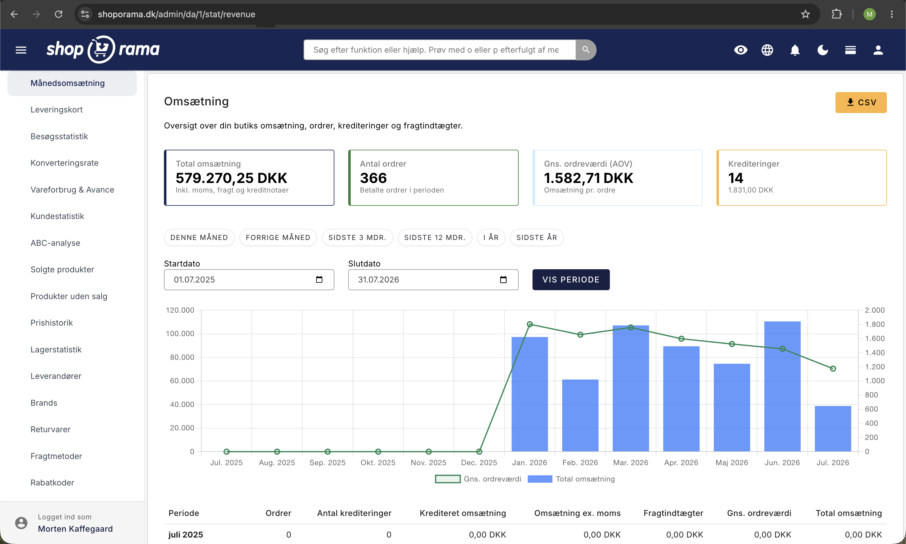
The revenue statistics under Statistics → Monthly Revenue show your sales figures over time: number of orders, credit memos (number and amount), revenue excluding tax, shipping revenue, and total revenue.
The view automatically adjusts to the time period you select. If you select up to 31 days, you’ll see daily figures. Between 31 and 90 days, the data is aggregated by week, and for periods over 90 days, monthly figures are displayed. This makes it easy to zoom in on a busy week or zoom out to see the overall pattern for the year.
Here, you can spot seasonal fluctuations and trends. When does your busy period start? When do sales typically drop? The figures help you plan campaigns, inventory management, and staffing so you’re ready when the season hits—instead of being caught off guard.
What Are You Actually Earning? Contribution Margin and Profit Margin Analysis
Revenue and profit are two very different things. Under Statistics → Cost of Goods Sold & Profit Margin, you can see what you’re actually earning: revenue excluding VAT, cost of goods sold (purchase price × quantity sold), gross profit, and contribution margin as a percentage—all calculated on a monthly basis.
A bar chart gives you a visual overview, with revenue and cost of goods sold as bars and the contribution margin as a curve. The comparison with the same month the previous year is displayed automatically: percentage change in revenue and change in contribution margin in percentage points, so you can see if your business is heading in the right direction.
Many online store owners have found that profit margin statistics opened their eyes to their actual earnings. You can easily sell more than last year and still earn less if your purchase prices have risen or you’ve offered too many discounts. The statistics keep you honest.
Note: This analysis requires that you’ve entered the purchase prices for your products. If purchase prices are missing, the system displays a warning showing the exact number of products and direct links so you can quickly fix the issue. You don’t need to be an accountant to use the numbers—but you do need to make sure the data is in order. Read more in the dedicated guide to inventory consumption and gross profit.
Pareto in Practice: Identify the 20% of Products That Generate 80% of Revenue
The Pareto principle states that approximately 20% of your products typically generate 80% of your revenue. The ABC analysis under Statistics → ABC Analysis puts this principle into practice by automatically sorting your products into three groups:
- A-products — the top 80% of the selected metric. Your most important items.
- B products — the next 15%. Solid, but not critical.
- C products — the remaining 5%. Many products with a small contribution.
You can classify products based on three metrics: revenue, units sold, and contribution margin. The real power lies in the ability to compare across these metrics. A product that’s an A in revenue but a C in contribution margin is a red flag: you’re selling a lot of it, but making almost nothing. Conversely, a C-rated product in terms of revenue that’s an A in terms of contribution margin is hidden gold—it deserves more marketing.
With filters for supplier, brand, and time period (30 to 365 days), color-coded badges, and CSV export, it’s a tool that scales from stores with 50 products to those with 5,000+. Instead of guessing, the analysis tells you exactly what’s worth spending time on. Read more in the dedicated ABC analysis guide.
How well does your store convert? Conversion Rate
Under Statistics → Conversion Rate, you can see what percentage of your visitors end up making a purchase. The page brings together the four most important metrics in a single overview: conversion rate, revenue, number of orders, and number of visitors—broken down by day or month.
You can switch between daily and monthly views and select the time period you want to analyze. The graph shows trends over time, so you can quickly see whether a campaign, a design change, or a season has had an effect on conversion.
The conversion rate is one of the most important metrics in e-commerce because it shows how effective your store is at turning visits into sales—regardless of traffic volume. Even a small improvement in the conversion rate can lead to a significant increase in revenue. Read more in the dedicated guide to conversion rates.
Where do your visitors come from? Visitor Statistics
Under Statistics → Visitor Statistics, you’ll get a detailed look at who’s visiting your online store, where they’re coming from, and how they’re behaving. This page is accessible via Statistics → Visitor Statistics in the menu and requires that you have enabled internal visitor statistics in your online store’s settings.
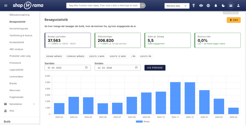
At the top, you’ll find four summary cards that give you a quick overview of the selected period: visits during the period (number of unique sessions), page views (total number of pages viewed), pages per visit (average number of pages a visitor views), and bounce rate (the percentage of visitors who leave the site after viewing only one page). Together, these four figures paint a clear picture of how active your visitors are.
A bar chart shows the number of visitors over time, allowing you to visually track trends day by day or month by month. This makes it easy to spot whether a campaign has driven extra traffic or if there are periods with unusually few visits.
One of the most valuable features is the overview of traffic sources, displayed as a donut chart. Here you can see the breakdown between direct traffic, Google organic, Facebook, newsletters, and other sources. This gives you a clear answer as to which marketing channels are actually driving traffic to your store—and which ones aren’t delivering. If you’re investing time and money in Facebook advertising but almost all your traffic comes from Google organic search, that’s a sign that you need to reevaluate your channel strategy.
The visitor statistics also include an analysis of average visits per day of the week, displayed as a bar chart. This reveals which days your customers are most active. That insight is worth its weight in gold when you’re scheduling newsletters, campaign launches, and social media posts—send your newsletter on the day when the most people visit your store, and you’ll reach them when they’re already in the mood to buy.
All data can be exported to CSV so you can further analyze the numbers in Excel or share them with your marketing partner. Read more in the dedicated guide to visitor statistics.
Discount codes—are your campaigns working?
Under Statistics → Discount Codes, you’ll see each discount code along with the number of times it’s been used, total discount amount, revenue, and average order value (AOV). This gives you a clear picture of whether your campaigns are actually driving additional sales—or simply offering discounts to customers who would have bought anyway.
The most important metric here is the difference in AOV with and without a discount. If customers with a discount code spend less than those without one, it suggests that the discount isn’t motivating them to make a larger purchase. Conversely, if the AOV with a discount is higher, the campaign is working as intended—customers are buying more because they feel they’re getting a good deal.
Use these statistics to continuously evaluate your discount strategies. Compare codes with different discount types (percentage discount vs. fixed amount, free shipping vs. price reduction) and see what provides the most value for your business. Read more in the dedicated guide to discount code statistics.
Sales by Channel — Where Does the Money Come From?
Under Statistics → Sales by Channel, you don’t just see which channels are sending visitors—you see which channels are actually generating revenue in kroner. This is a crucial distinction because a channel with a lot of traffic isn’t necessarily the one driving the most sales.
For each traffic source (Google Organic, Facebook, newsletter, direct, paid ads, etc.), you’ll see the number of orders, total revenue, and average order value. This allows you to assess which marketing channels provide the best return on investment—and where you should invest more or less.
For example, if newsletters account for only 5% of your visits but 20% of your revenue, that’s a sign that you should prioritize email marketing more highly. The numbers give you a factual basis for allocating your marketing budget, rather than relying on guesswork. Read more in the dedicated guide to sales by channel.
Time Analysis — When Do Your Customers Shop?
Under Statistics → Time Analysis, you’ll see your orders broken down by day of the week and time of day, visualized as a heat map. The colors show when activity is highest—dark areas indicate many orders, while light areas indicate few.
The pattern reveals when your customers are most ready to buy. Perhaps most of them shop in the evening between 7 p.m. and 10 p.m., or maybe your store is particularly active on the weekend. That knowledge is worth its weight in gold when it comes to timing your activities: send newsletters right before peak times, launch campaigns when your customers are online, and schedule customer service around the times when activity is highest.
The heat map also gives you an overview of whether your campaigns are hitting the mark. If you send newsletters on Tuesday mornings, but your heatmap shows that your customers primarily shop on Thursday evenings, it might be worth experimenting with the timing. Read more in the dedicated guide to timing analysis.
Abandoned carts—how many are recovered?
Under Statistics → Abandoned Carts, you’ll see a history of shopping carts that didn’t result in orders—and, more importantly, how many of them were recovered via reminder emails. The recovery rate shows what percentage of abandoned carts ultimately result in completed purchases.
Abandoned carts are one of the biggest sources of lost revenue in e-commerce. By tracking the recovery rate over time, you can measure whether your reminder emails are effective and whether changes in timing or content improve the results. A recovery rate of 10–15% is a good starting point—if you’re below that, there’s likely room for improvement.
The statistics also show the total number of abandoned carts, the potential revenue, and the trend over time, so you can assess whether the problem is growing or shrinking. Read more in the dedicated guide to abandoned cart statistics.
Customer Retention — Do Your Customers Return?
Under Statistics → Customer Retention, you’ll see your customers grouped by when they made their first purchase (cohorts) and how many return to make another purchase in the following months. The data is visualized as a heatmap grid, where the rows are cohorts and the columns are months after the first purchase.
The color coding makes it easy to interpret: the darker the cell, the larger the percentage of the cohort that has made a repeat purchase in that month. A healthy pattern shows a stable or increasing retention rate over time—this means your customers are coming back because they’re satisfied with the products and the experience.
Cohort analysis is particularly useful for measuring the impact of changes over time. If you launch a loyalty program or improve your customer service, you can compare the retention rates for cohorts before and after the change to see if it actually makes a difference. Read more in the dedicated guide to customer retention.
Which products are most often purchased together? Discover hidden sales patterns
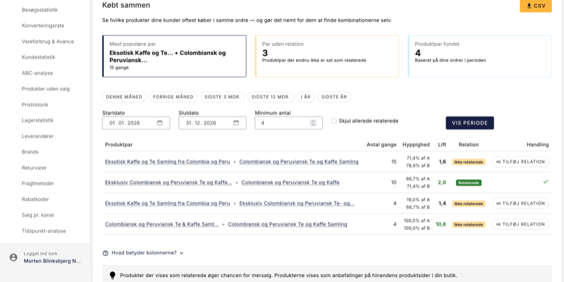
Under Statistics → Bought Together, you’ll get an overview of which product pairs your customers most often add to their cart at the same time. This can reveal combinations you might never have thought of yourself—and which you can actively use to increase your average order value.
For each product pair, a lift metric is displayed that tells you whether the correlation is real or merely coincidental. A lift above 1 means the two products are purchased together more often than expected—these are the ones worth acting on. With a single click, you can add a pair as related products, so the recommendations automatically appear on the product pages in your store. You can filter by time period, minimum quantity, and hide the pairs that are already set as related, so you can quickly find the next obvious step.
If you’d like to dive deeper into this feature, you’ll find a step-by-step walkthrough in the dedicated guide to “Bought Together.”
Who Are Your Customers? Customer Statistics
Under Statistics → Customer Statistics, you’ll get a detailed insight into your customers’ behavior and value. The page displays key metrics such as the number of customers, the repeat customer rate, average customer lifetime value, and the breakdown between new and returning customers.
You can view your top 20 customers ranked by revenue and track the trend in new vs. returning customers over time. A high percentage of returning customers is a sign of a healthy business—it’s far cheaper to retain an existing customer than to acquire a new one.
Use customer statistics to identify your most valuable customers, assess whether your marketing is attracting loyal customers, and detect changes in customer behavior over time. Read more in the dedicated guide to customer statistics.
Is your inventory healthy? Inventory Statistics
Under Statistics → Inventory Statistics, you’ll get an overview of your inventory’s status, with a focus on the products that require action. The page is divided into tabs: dead stock, reordering, and inventory turnover broken down by suppliers and brands.
Dead stock shows products that have been sitting in inventory without being sold—tied-up capital that isn’t working for you. The reorder list highlights products with low inventory levels that are still selling well, so you can reorder them in time. Inventory turnover shows how quickly your items are moving, calculated in COGS and days sales of inventory (DSI) by supplier and brand.
A healthy inventory is all about balance: enough items to meet demand, but not so much that capital sits idle. Inventory statistics give you the numbers you need to strike that balance. Read more in the dedicated guide to inventory statistics.
Are your newsletters effective? Open rates and clicks
If you use Shoporama’s newsletter module, you’ll find statistics for each campaign under Newsletter → Statistics. Here you’ll see the send date, number of recipients, opens with an open rate in percent, and clicks with a click-through rate in percent.
These figures help you assess what’s working. If one newsletter has twice the open rate of the others, it’s likely the subject line that’s making the difference. A high open rate but low click-through rate suggests that the content doesn’t live up to the promise in the subject line—or that there’s a lack of clear calls to action.
Use the numbers to experiment systematically: test different subject lines, send times, and content types, and let the statistics tell you what your customers respond to.
Your Best- and Worst-Selling Products
Under Products → Product Performance, you can view sales statistics at the product level with the option to filter by time period. This gives you direct insight into which products are driving sales—and which ones are gathering dust.
The performance overview complements the ABC analysis with a more product-focused perspective. While the ABC analysis classifies and ranks, product performance lets you quickly look up individual products and view their sales history over time.
Use it to identify products that should be highlighted in your store, products that should be put on sale to free up inventory space, and products that perhaps shouldn’t be in your lineup anymore.
Practical Tips: Get the Most Out of Your Statistics
- Enter purchase prices for all products. Without purchase prices, neither the profit margin analysis nor the contribution margin from the ABC analysis can be calculated. This is the most important step to getting the full value from your statistics.
- Use the CSV export feature. Both the ABC analysis and the profit margin statistics can be exported to CSV. This is handy if you want to perform additional calculations in Excel or share data with your accountant.
- Check the dashboard daily. It takes less than a minute and gives you a sense of whether anything is out of the ordinary—before it becomes a problem.
- Review your profit margin monthly. A declining profit margin over several months is an early warning sign. The sooner you spot it, the easier it is to take action.
- Run the ABC analysis quarterly. Product rankings change over time. A regular review helps you adjust inventory, marketing, and your product lineup.
- Monitor the conversion rate on an ongoing basis. Even small changes in the conversion rate have a significant impact on the bottom line. Use this metric to measure the impact of design changes and campaigns.
- Keep an eye on the repeat customer rate. A growing percentage of repeat customers is a sign that your store is building loyalty—and that’s more cost-effective than constantly acquiring new customers.
- Clear out dead stock. Products that don’t sell tie up capital. Use inventory statistics to identify them and consider sales, bundling, or liquidation.
- Compare metrics in the ABC analysis. Use the “Compare With” feature to find products that sell well but have poor margins—or vice versa.
- Use supplier statistics for negotiations. Documented sales figures give you a stronger negotiating position when discussing prices and terms with suppliers.
- Keep an eye on return patterns. If a product or variant stands out, it’s cheaper to investigate the cause than to keep handling returns.
- Compare AOV with and without discounts. If customers with discount codes spend less, you may be offering discounts to customers who would have bought anyway.
- Check the recovery rate for abandoned carts. A recovery rate below 10% suggests that your reminder emails could be improved—or that they aren’t enabled.
- Check your traffic sources monthly. If organic traffic is declining, it could mean that competitors have overtaken you in search results—or that your SEO efforts need a refresh.
Get Started
Statistics are most valuable when they’re not a one-time check but a regular part of your routine. Use the dashboard to monitor daily performance, the revenue graph to spot trends over time, and the ABC analysis and profit margin overview for strategic decisions.
Together, Shoporama’s analytics tools give you the foundation you need to run your online store more effectively and profitably. You don’t need to be a data analyst to get started—open Analytics in the menu and start with what’s most relevant to you right now.
Related articles
Conversion rate - understand and improve your stats
Understand what your conversion rate means and how to use the statistics page in Shoporama to track your progress over time.
Customer statistics - understand your customers' behavior
The Customer Statistics page in Shoporama gives you an overview of return rates, customer segments and your most valuable customers.
Warehouse statistics - overview of your warehouse
Stock statistics give you a complete overview of your stock situation - from tied up capital in dead stock to products that are running low.
ABC analysis: Find out which products make you money
Learn how to use ABC analysis to prioritize your assortment, optimize your inventory and focus on the products that actually drive your business.
Sales reports and revenue in dashboard
Guide to using the dashboard and sales reports in Shoporama to track revenue, orders and sales statistics.
See your revenue
Guide to viewing your revenue in Shoporama - both on the front page, via the detailed revenue statistics with graphs, and via order export.
Open baskets - View and restore abandoned shopping carts
Split testing in your Shoporama online store
Guide to setting up and running server-side split tests (A/B tests) in Shoporama.
Delivery Map: See where your customers receive their packages
The delivery map shows, on a map, where in the country your customers receive their packages. View hotspots with a heat map, track today’s sales...
Related features
New visitor statistics - understand your eCommerce traffic
See who visits your online store, which days are busiest and where the traffic comes from. Shoporama's new visitor statistics give you the overview.
Statistics and analytics
Dashboard, revenue, profit margin, ABC analysis and more. Shoporama's built-in statistics tools give you insights to run your online store profitably.
Your orders already know what customers want. Now you can see it
The Bought together statistics feature finds the product pairs your customers consistently buy in the same order. Add recommendations with one...
Return center - handle returns professionally
Manage returns, issue credit notes and refunds to the customer's card. With return statistics and automatic inventory management.